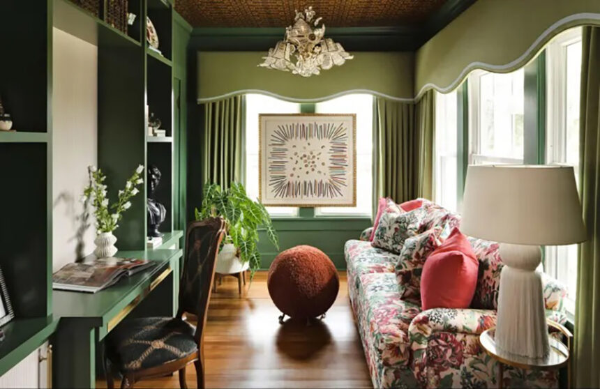
In the realm of interior design, trim was once overlooked amidst the allure of trendy colors and patterns. However, a new trend has emerged, urging designers and homeowners alike to rethink the role of trim in home decor. From vibrant hues to muted pastels, interior trim is now a canvas for creative expression. Here are the top 10 paint colors for your interior trim, according to designers:
- Benjamin Moore’s Chartreuse
Embrace drama with Benjamin Moore’s Chartreuse (2024-10), a striking hue that elevates any space. Ideal for millwork, this vibrant shade adds a confident accent to baseboards and doors, creating a spectacular visual impact.
- Benjamin Moore’s Mozart Blue
For a joyful and invigorating atmosphere, consider Benjamin Moore’s Mozart Blue (1665). This medium blue strikes a perfect balance between vibrancy and warmth, infusing a room with energy without overpowering it.
- Benjamin Moore’s Autumn Purple
Explore the richness of jewel tones with Benjamin Moore’s Autumn Purple (2073-20). This eggplant purple exudes vibrancy while maintaining an earthbound quality, making it a versatile choice for trim, wainscoting, or entire rooms.
- Benjamin Moore’s Hidden Sapphire
Pairing colorful trim with wallpaper is a winning combination, as demonstrated by Benjamin Moore’s Hidden Sapphire (CSP-69). This medium blue complements aquatic-themed wallpaper, adding clarity and vibrancy to the space.
- Farrow & Ball’s Pink Drab
Pastel hues can make a statement too, as seen with Farrow & Ball’s Pink Drab No. 207. This dusty rose brings a cozy, snug feel to any room, creating an inviting atmosphere reminiscent of British charm.
- Sherwin-Williams’ Rookwood Jade
For those working with white walls, Sherwin-Williams’ Rookwood Jade (SW 2812) offers a playful yet measured pop of color. This medium earthy green adds depth to a space without overwhelming it, striking a perfect balance between boldness and subtlety.
- Dunn-Edwards’ Light Gray
Neutral tones like Dunn-Edwards’ Light Gray (DEC789) bring a touch of Scandi style to any interior. Perfect for contrasting trim, this light gray hue complements soft textures and creates a calming ambiance.
- Fine Paint of Europe’s Tuxedo Red
Make a statement with Fine Paint of Europe’s Tuxedo Red, a bold shade that adds flair to any space. Paired with a bright blue wallcovering, this tomato red hue exudes cheerfulness and sophistication.
- Benjamin Moore Sweet Basil
Explore the versatility of green with Benjamin Moore’s Sweet Basil (455), a deep forest green that adds a touch of moodiness to a room. This rich hue brings the outdoors inside, creating a connection to nature while maintaining a sense of warmth.
- Benjamin Moore’s Chantilly Lace
For a timeless and understated look, consider Benjamin Moore’s Chantilly Lace (OC-65). This classic white trim color provides a neutral foundation that allows other decor elements to shine, making it the perfect choice for a clean and minimalist aesthetic.
Incorporating color into interior trim is a simple yet effective way to enhance your home’s aesthetic and create a personalized space that reflects your unique style. Whether you opt for bold jewel tones or subtle neutrals, these expert-recommended paint colors will help you transform your interior with confidence.


Leave a Reply