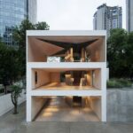
Situated on Changle Road, a historical center of Shanghai, the Yearly Plan Shanghai building stands as a testament to the city’s rich cultural heritage. Designed by dongqi Design, this three-story exhibition and retail space pays homage to the original texture of Shanghai while embracing innovative architectural elements.
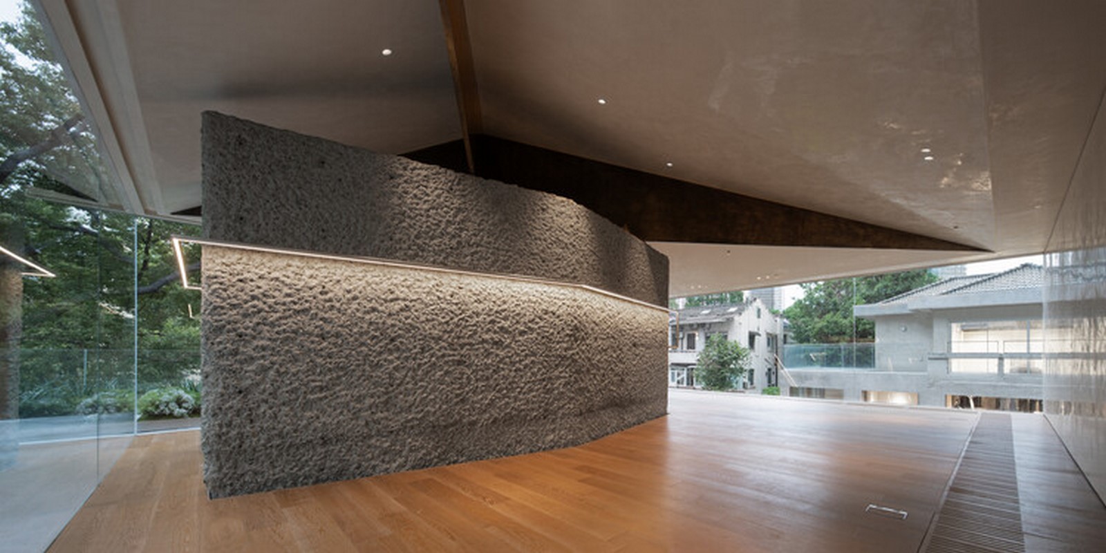
Preserving Historical Texture
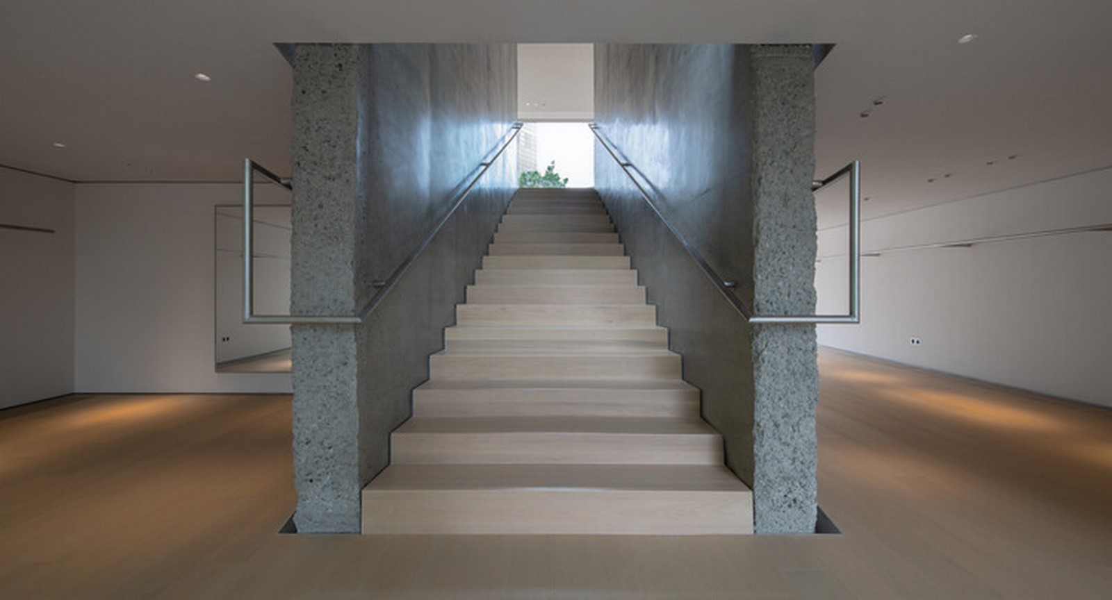
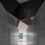
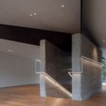
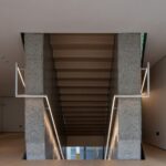
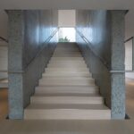
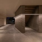
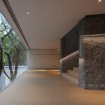
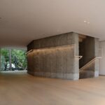
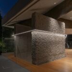
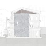
dongqi Design aimed to preserve the massing of the old building, ensuring that the project seamlessly integrates with the surrounding historical context. The vertical piers, comprising two concrete special-shaped piers flanking the stairs, serve as the primary structural elements within the space. These piers, resembling rough rocks, maintain the city’s architectural character while providing a unique visual aesthetic.
Innovative Structural Design
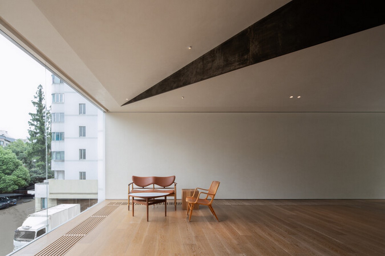
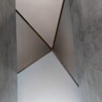
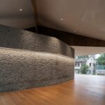
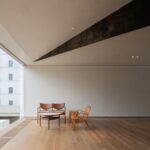
The building features large non-frame glass curtain walls and pillarless spaces, offering panoramic views of the courtyard and Changle Road. The roof, supported by four 40mm thick steel plates, forms an asymmetrical eccentric structural system, each plate boasting a unique shape and cantilever distance of up to 7 meters. This innovative design creates a dynamic and visually striking architectural silhouette.
Functional Integration
MEP systems are seamlessly integrated into the building’s structure, optimizing floor height and maximizing spatial efficiency. The stair handrail, crafted from stainless steel round rods, serves a dual purpose as both a handrail and a clothing hanging rod in the display area, demonstrating a thoughtful blend of functionality and aesthetics.
Sustainable Features
Careful consideration has been given to sustainable features, such as rain gutters designed to harmonize with the proportions of the building’s façade. Rainwater is directed into customized stainless steel flower pools on the terrace, nurturing the landscape and enhancing the natural ambiance of the space.
Facade Design
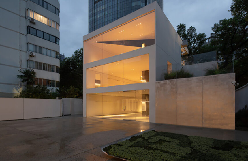
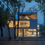
The proportions of the building’s facades have been meticulously analyzed, with the courtyard-facing facade resembling three horizontal scrolls. During the day, these facades reflect the surrounding scenery, while at night, they offer a glimpse into the interior ambiance, creating a captivating visual experience for visitors.
Conclusion
The Yearly Plan Shanghai Gallery and Retail Space by dongqi Design represents a harmonious blend of tradition and innovation. By preserving the historical texture of Shanghai while incorporating cutting-edge architectural elements, this building serves as a symbol of the city’s cultural heritage and its commitment to progressive design.


Leave a Reply